Advanced Typography /Task 1: Exercise 1 & 2
Start from 30.08.2023
30.08.2023 -13.09.2023 /Week 1- Week 3
Kong Cai Yi / 0363862
Advanced Typography / Bachelor of Design (Hons) in Creative Media
Task 1:
Kong Cai Yi / 0363862
Advanced Typography / Bachelor of Design (Hons) in Creative Media
Task 1:
Exercise 1-Typographic System
Exercise 2-Type and Play

INDEX
1. Lectures:
Exercise 2: Type & Play
Introduction & Typographic systems


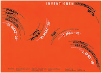
Artists like David Carson, Barnbrook and Paula Scher pushed the boundaries.
Incredible amount of planning and intuition were used to create exciting
compositions. Below are some examples from the artists.
3.
Feedback
4.
Reflections
LECTURES
Week 1Introduction & Typographic systems
There are eight major variations with an infinite number
of permutations. These eight major variations are as follows:


Fig 1.1 Typographic systems (1.9.2023-week 1)
- Axial: All elements are organised to the left or right of a single axis.

Fig 1.2 Axial layout (1.9.2023-week 1)

Fig 1.2 Axial example (1.9.2023-week 1)
- Radial:All elements are extended from a point of focus.


Fig 1.3 Radial system (1.9.2023-week 1)
- Dilatational: All elements expand from a central point in a circular fashion


Fig 1.4 Dilatational system (1.9.2023-week 1)
-
Random: Elements appear to have no specific pattern or relationship.

Fig 1.5 Random system (1.9.2023-week 1)
- Grid: A system of vertical and horizontal divisions.


Fig 1.6 Grid system (1.9.2023-week 1)
- Transitional: An informal system of layered banding.

Fig 1.7 Transitional system (1.9.2023-week 1)
- Modular: A series of non-objective elements that are constructed as a standardised unit.

Fig 1.8 Modular system (1.9.2023-week 1)
- Bilateral:All text is arranged symmetrically on a single axis.

Fig 1.9 Bilateral system (1.9.2023-week 1)
Week 2
Typographic Composition
Typographic Composition
Typographic composition is the arrangement of textual information on a
given space.Some of the most common composition are emphasis, rule of
thirds and grid system.
- Principles of Design Composition: Emphasis, isolation, repetition, balance (symmetry/asymmetry), alignment, perspective, rhythm, contrast.

Fig 1.10 Principle of design-emphasis (7.9.2023-week 2)
- The Rule of Thirds :The Rule of Thirds is a photographic guide to composition, it basically suggest that a frame (space) can be divided into 3 columns and 3 rows. The intersecting lines are are used as guide to place the points of interest, within the given space.

Fig 1.11 The rule of Thirds (7.9.2023-week 2)

Fig 1.12 Examples of post-modernist style (7.9.2023-week 2)
- Environmental Grid: Based on the exploration of an existing structure or numerous structures combined.

Fig 1.13 Environmental grid, Typographic design: Form and communication
(2015) (7.9.2023-week 2)
- Form and Movement: Based on the exploration of an existing Grid Systems. The placement of a form on a page, over many pages creates movement. The forms could represent images, text or colour.
Week 3
Context & Creativity
Context & Creativity
Handwriting
- We study handwriting because the first mechanically produced letterforms were designed to directly imitate handwriting. Handwriting would become the basis or standard for form, spacing and conventions mechanical type would try and mimic.
- The shape and line of hand drawn letterforms are influenced by the tools and materials used to make them. Sharpened bones, charcoal sticks, plant stems, brushes, feather and steel pens all contributed to the unique characteristics of the letterform.
- Additional factors included the material upon which the forms were written: clay, papyrus, palm leaf, animal skins (vellum and parchment) and paper

Fig 1.14 Evolution of the latin alphabet (13.9.2023-Week 3)
- As ideograms, to represent the things they actually depict
- As determinatives to show that the signs preceding are meant as phonograms and to indicate the general idea of the word.
- As phonograms to represent sounds that "spell out" individual words

Fig 1.15 Ancient Egypt Hieroglyphics Chart (13.9.2023-Week 3)
- Early greek (5th C. B.C.E.): Drawn freehand, not constructed with compasses and rules, and they had no serifs. In time the strokes of these letters grew thicker, the aperture lessened, and serifs appeared.
- Roman Uncials: By the 4th century Roman letters were becoming more rounded, the curved form allowed for fewer strokes and could be written faster.
- English Half Uncials (8th C.): In England, the uncial evolved into a more slanted and condensed form.
- Carolingian Minuscule: Capitals at the start of a sentence, spaces between words and punctuation. It was this style that became the pattern for the Humanistic writing of the fifteenth century; this latter, in turn, was the basis of our lower-case roman type.
- Black Letter (12-15 C. CE): Characterised by tight spacing and condensed lettering. Evenly spaced verticals dominated the letterform. Condensing line spacing and letter spacing reduced the amount of costly materials in book production.
- The Italian Renaissance: Newly rediscovered letterforms Antica. The renaissance analysis of form that was being applied to art and architecture was directed toward letterform — resulting in a more perfect or rationalised letter.

Fig. 1.16 Letterforms through the ages (13.9.2023-Week 3)
- Evolution of Middle Eastern Alphabets: It is also important to note that while the Phoenician letter marks a turning point in written language- use of sound represented in letters the script itself has been possibly influenced by the Egyptian Hieroglyphics and Hieratic Scripts.

Fig 1.17 Evolution of Middle Eastern Alphabets (13.9.2023-Week 3)
- The Evolution of the Chinese script: From the Oracle bone to Seal Script to Clerical Script, Traditional and Simplified scripts.

Fig 1.18 The Evolution of the Chinese script (13.9.2023-Week 3)
- The Italian Renaissance: Newly rediscovered letterforms Antica. The renaissance analysis of form that was being applied to art and architecture was directed toward letterform — resulting in a more perfect or rationalised letter.

Fig 1.19 ‘Indian’ subcontinent the Indus Valley Civilization (IVC) script
(3500-2000 BCE)
(13.9.2023-Week 3)
The oldest writing found in the ‘Indian’ subcontinent the Indus Valley Civilization (IVC) script (3500-2000 BCE), is as yet undeciphered and seems to have been somewhat logo-syllabic in nature.

Fig 1.20 Brahmi script (450–350 BCE)(13.9.2023-Week 3)
The earliest writing system developed in India after the Indus script. It is one of the most influential writing systems; all modern Indian scripts and several hundred scripts found in Southeast and East Asia are derived from Brahmi.

Fig. 1.21 Southeast Asia scripts, scripts of the communities that
assimilated into Peninsula Malay communities.(13.9.2023-Week 3)
Handwriting
- Jawi, the Arabic-based alphabet. We all know Jawi was introduced along with Islam. But how this happened is more interesting than we converted and adopted the Arabic alphabet".
- n modern Malaysia, Jawi is of greater importance because it's the script used for all our famous works of literature. Every hikayat and Malay charm book is written in Jawi. Unlike Indonesia, we don't have a huge wealth of pre-Jawi inscriptions and writings this part of the reason why some tend to ignorantly claim that Jawi is "tulisan asal Melayu", which is of course untrue.


Fig. 1.22 Jawi & Demak (13.9.2023-Week 3)
Programmers and Type Design
- More vernacular scripts are being produced by software giants (Google): in their employment a great many Asian programmers and designers. More and more vernacular and "multi-script" typefaces - a term coined by Muthu Nedumaran are being produced to cater to situations where the written matter is communicated in the vernacular script or vernacular and Latin scripts.

Fig. 1.23 Programmers and Type Design (13.9.2023-Week 3)
Week 4
Designing Type
Designing Type
Why design another typeface?
Xavier Dupré (2007) in the introduction of his typeface Malaga suggested two
reasons for designing a typeface:
- Type design carries a social responsibility so one must continue to improve its legibility.
- Type design is a form of artistic expression.
Type Design Process
1. Research
- Understand type history, type anatomy, type conventions and terminologies.
- Determine the type’s purpose or what it would be used for and what different applications it will be used in.
- Study existing fonts that are presently being used for inspiration/ideas/reference/context/usage pattern/etc.
- Traditional:Some designers sketch their typeface using the traditional tool set (brushes/ pens, ink and paper) then scan them for the purpose of digitization. They are more confident with their hands and have better control using it.
- Digital: Some designers sketch their typeface using digital tool sets, such as Wacom directly into a font design software (much quicker, persistent, and consistent) but this can sometimes impede the natural movement of hand strokes.
3. Digitisation

Typeface Construction: Using grids (with circular forms) can facilitate the construction of letterforms and is a possible method to build/create/design your letterform.

Construction and considerations:Different forms and constructions must be taken into account when designing a new type. An important visual correction is the extrusion of curved (and protruding) forms past the baseline and cap line (overshoot). This also applies to vertical alignment between curved and
- Professional softwares: FontLab and Glyphs App. Some designers also use Adobe Illustrator then only the specialised font apps. This however is frowned upon by the purist.
- The results of testing are part of the process of refining and correcting aspects of the typeface. Prototyping is also part of the testing process and leads to important feedback. Depending on the typeface category (display type/text type) the readability and legibility of the typeface becomes an important consideration. However, it is not as crucial if the typeface is a display type, where expression of the form takes a little more precedence.
- Even after deploying a completed typeface there are always teething problems that did not come to the fore during the prototyping and testing phases. Thus, the task of revision doesn’t end upon deployment. The rigour of the testing is important so that the teething issues remain minor.

Fig. 1.24 Deploy (20.9.2023-Week 4)
Typeface Construction: Using grids (with circular forms) can facilitate the construction of letterforms and is a possible method to build/create/design your letterform.

Fig. 1.25 Construction grid for roman capitals (8 x 8 cells)
(20.9.2023-Week 4)
Construction and considerations:Different forms and constructions must be taken into account when designing a new type. An important visual correction is the extrusion of curved (and protruding) forms past the baseline and cap line (overshoot). This also applies to vertical alignment between curved and
straight forms.
Fitting the type: A visual correction is also needed for the
distance between letters. The letters must be altered to a uniform visual
white space - the white space between the letters should appear the same.


Fig. 1.26 Classification according to form and construction
(20.9.2023-Week 4)
Week 5
Perception and Organisation
Perception and Organisation
- Perception is "the way in which something is regarded, understood, or interpreted". So, is perception what you see and therefore understand--or what you are manipulated into seeing and understanding?
- Perception in typography deals with the visual navigation and interpretation of the reader via contrast, form and organisation of the content. Content can be textual, visual, graphical or in the form of colour. However our focus today is in typography.
- Size: A contrast of size provides a point to which the reader's attention is drawn. For example if you have a big letter and a small letter you will obviously see the big letter first before the small. The most common use of size is in making a title or heading noticeably bigger than the body text.

Fig. 1.27 Size (by Carl Dair) (26.9.2023-Week 5)
-
Weight:Weight describes how bold type
can stand out in the middle of lighter type of the same style. Other
than then using bold, using rules, spot, squares is also provide a
"heavy area" for a powerful point of visual attraction or emphasis,
therefore not only types of varying weight.


Fig 1.28 Weight (26.9.2023-Week 5)
- Form: Contrast of form is the distinction between a capital letter and its lowercase equivalent, or a roman letter and its italic variant, condensed and expanded versions of typeface are also included under the contrast of form.


Fig 1.29 Form (26.9.2023-Week 5)
- Structure: Structure means the different letterforms of different kinds of typefaces. For example, a monoline sans serif and a traditional serif, or an italic and a blackletter.


Fig 1.30 Structure (26.9.2023-Week 5)
- Texture: By putting together the contrasts of size, weight, form, and structure, and applying them to a block of text on a page, you come to the contrast of texture. Texture refers to the way the lines of type look as a whole up close and from a distance. This depends partly on the letterforms themselves and partly on how they're arranged.


Fig 1.30 Texture (26.9.2023-Week 5)
- Direction: Contrast of direction is the opposition between vertical and horizontal, and the angles in between. Turning one word on its side can have a dramatic effect on a layout. Text blocks also have their vertical or horizontal aspects of direction. Mixing wide blocks of long lines with tall columns of short line can also create a contrast.


Fig 1.30 Direction (by Carl Dair) (26.9.2023-Week 5)
- Color: The use of color is suggested that a second color is often less emphatic in values than plain black on white. Therefore it is important to give thought to which element needs to be emphasized and to pay attention to the tonal values of the colors that are used.


Fig 1.31 Colour (26.9.2023-Week 5)
Overall:
 Fig 1.32 Contrast (26.9.2023-Week 5)
- The overall look and feel of the elements that make up the typographic composition. To represent a concept by doing so in a visual form. The interplay of meaning and form brings a balanced harmony both in terms of function and expression.
- Originating from the Greek words "typos" (form) and "graphis" (writing), typography means to write in accordance with form.
- Typography can be seen as having two functions:
- to represent a concept
- to do so in a visual form.
- Displaying type as a form provides a sense of letterforms' unique characteristics and abstract presentation.


Fig 1.33 Form (26.9.2023-Week 5)
Organisation- Gestalt: Gestalt theory emphasizes that the whole of anything is greater than its parts this is based on the idea that we experience things as unified whole: Instead of breaking down thoughts and behavior to their smallest elements, the gestalt psychologists believed that you must look at the whole of experience.
- The Law of Similarity is the gestalt grouping law that states that elements that are similar to each other tend to be perceived as a unified group. Similarity can refer to any number of features, including color, orientation, size, or indeed motion.
- The Law of Proximity is the gestalt grouping law that states elements that are close together tend to be perceived as a unified group. This straightforward law states that items close to each other tend to be grouped together, whereas items further apart are less likely to be grouped together.
- The Law of Closure refers to the mind's tendency to see complete figures or forms even if a picture is incomplete, partially hidden by other objects, or if part of the information needed to make a complete picture in our minds is missing.
- Law of (Good) Continuation holds that humans tend to perceive each of two or more objects as different, singular, and uninterrupted object even when they intersect. The alignment of the objects or forms plays a major role for this principle to take effect.
INSTRUCTIONS
<iframe
src="https://drive.google.com/file/d/187ekaFuIJYhJbZYeN7xc8Y0FAt65K29Q/preview"
width="640" height="480" allow="autoplay"></iframe>

Topic 11: Typographic Design Education
The rapid advance of technology and the expanding role of visual and media-based communication in contemporary society have created new challenges for typographic education. Faced with a complex communications environment, and the changes that are occurring and are anticipated, how can a designer nurture sensitivity to typographic form and communication?

have been reduced into visually simplified forms. Each letter is coupled with a flower whose name begins with the chosen letter.


Type style, size, and placement can express the meaning of words. Effective visual organization is achieved with the help of a grid. Words and pictures strengthen and even alter each other’s meaning.


hierarchy and composition, students built on their knowledge of letterspacing, wordspacing, linespacing, rags, and alignment.


Week 1/Typographic System:
For this exercise, we are to explore 8 systems which are Axial,
Radial, Dilatational, Random, Grid, Modular, Transitional and
Bilateral in InDesign using the content given in the MIB.
Instructions given:


.jpg)
Week 2-Modification
After feedback that are given by Mr Vinod:


-01.jpg)
Week 2/ Type and Play:
Letterform extraction:


Digitalisation:


Final Finding Type


In the first week, we were assigned 8 typographic
system exercises, which caused me some stress.
Additionally, I haven't really gotten back into the
mood for classes, so I'm feeling quite anxious about
catching up with everything in this first
week. During Exercise 1, I could grasp the
concepts of the first few systems, but I struggled
with the requirements for the latter four systems,
especially for the Modular and Transitional system.
Afterward, I found that incorporating pink color
elements made them look more lively and appealing.
Moving on to Exercise 2, I wanted to create a font with a sense of luxury and sophistication, so I searched for an image related to palace interiors. However, I should have looked for an image with repetitive elements instead of a large scene with different elements, as it lacked consistency. Mr Vinod advised me to apply one letter's characteristic to the others, and I found it improved the design somewhat.
This learning experience has allowed me to understand each
typographic system and how to apply them. It requires a lot
of patience to adjust the size and position of each element
during the design process. It's a task that demands time and
effort, but completing it gives a great sense of
accomplishment. Additionally, for Exercise 2, I feel that it
teaches me how to give a font a consistent set of features,
ensuring the uniformity of the entire set of
characters.
Based on the list of recommended readings in the module information
booklet, I did some further reading with the book "Typographic Design
Form Communication" which also related to this task.
- Watch Lecture 1 and then the video tutorials: InDesgin Formatting & Additional explanation on the Modular System.
- Refer to sample student Eportfolio should you wish to analyse and evaluate exemplary work (see TEAMS: Class Notes > Exemplary Eportfolio & Tasks)
- Update your eportfolio with the necessary Lectures and process work (research + process) followed by final outcomesof your processes. Ensure to segregate the final outcomes. Update your reflection and further reading. Refer to best practices in exemplary works.
- Export final outocmes as JPEG @300ppi grayscale; PDF (turn off spreads) with and without guides (turn on guides when saving PDF)
- Size 200 x 200 mm
- Colours: Black and additional colour
- Minor graphical elements
- We are required use the following content:
The Design School,
Taylor’s University
All Ripped Up: Punk Influences on Design
or
The ABCs of Bauhaus Design Theory
or
Russian Constructivism and Graphic Design
Open Public Lectures:
June 24, 2021
Lew Pik Svonn, 9AM-10AM
Ezrena Mohd., 10AM-11AM
Suzy Sulaiman, 11AM-12PM
June 25, 2021
Lim Whay Yin, 9AM-10AM
Fahmi Reza, 10AM-11AM
Manish Acharia, 11AM-12PM
Lecture Theatre 12
-
I choose 'The ABCs of Bauhaus Design Theory' from between that three options.
Research
Before I start this exercise, I tried to do some research at
Pinterest to find inspiration, I am not sure how dilatational
system work, so I find more of it.


Fig 2.1 Research (1.09.2023-Week 1)
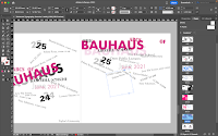
Indesign Progress
After I watched the lecture related to this exercise,
I follow the step and instructions Mr Vinod was given and
start my design journey in InDesign.


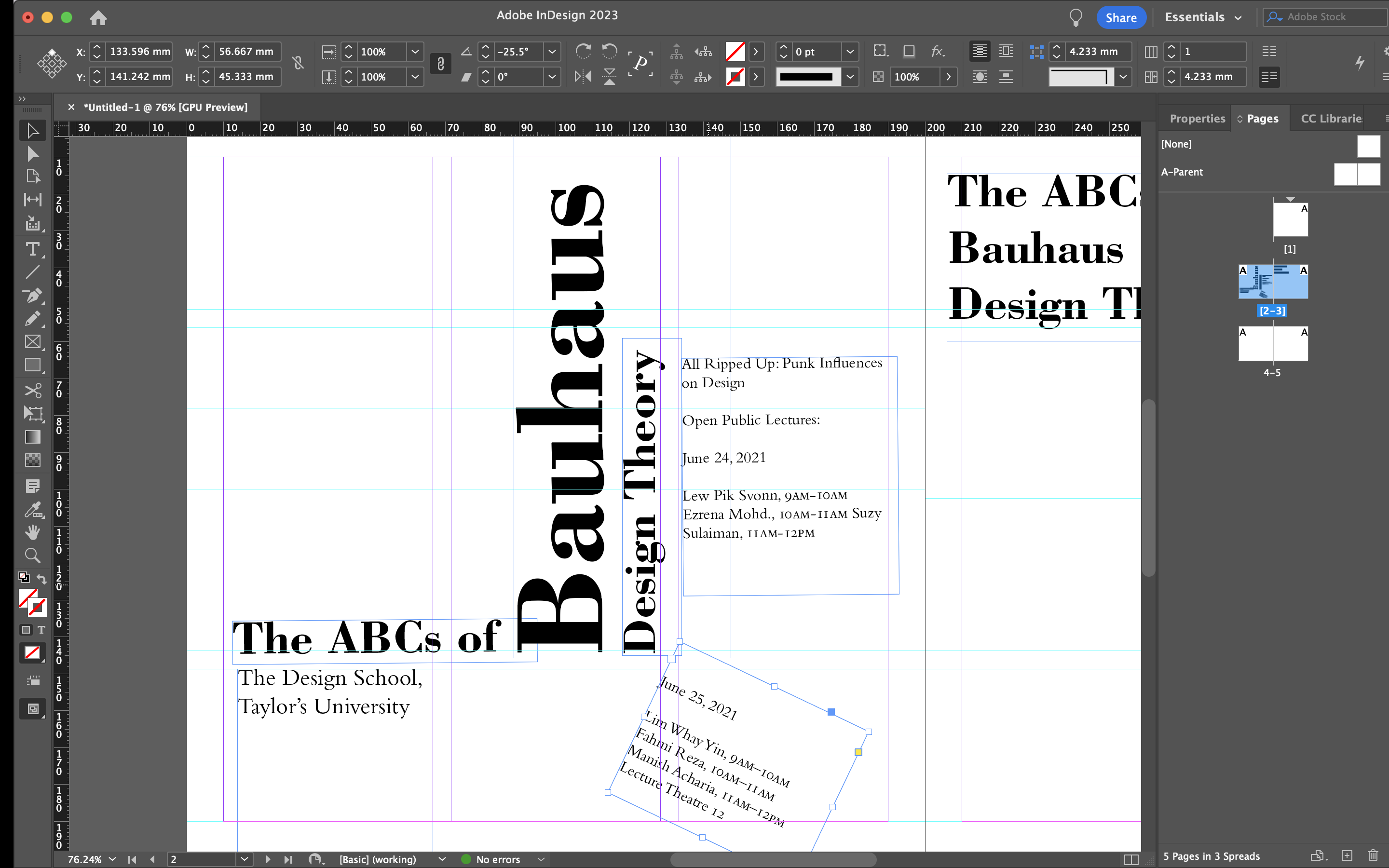


Fig 2.2 Indesign progress (03.09.2023-Week 1)
Week 1 Attempt Progression
I did two version of each system to find more
possibility.

Fig 2.3 Axial system (1.9.2023-Week 1)

Fig 2.4 Radial system (1.9.2023-Week 1)

Fig 2.5 Dilatational system (1.9.2023-Week 1)

Fig 2.6 Random system (2.9.2023-Week 1)

Fig 2.7 Grid system (2.9.2023-Week 1)

Fig 2.8 Modular system (2.9.2023-Week 1)

Fig 2.9 Transitional system (3.9.2023-Week 1)

Fig 2.10 Bilateral system (3.9.2023-Week 1)
.jpg)
Fig 2.11 First version of all system (3.9.2023-Week 1)
After feedback that are given by Mr Vinod:
- Random system not random enough.
- Radial system have some mistake for the tittle, should be radial everything as well.
- Bilateral system should not have vertical line.
I decided to do some modification, this is the final
version of each system:

Fig 2.12 Final Axial system (7.9.2023-Week 2)

Fig 2.13 Final Radial system (7.9.2023-Week 2)

Fig 2.14 Final Dilatational system (7.9.2023-Week 2)

Fig 2.15 Final Random system (7.9.2023-Week 2)

Fig 2.16 Final Grid system (7.9.2023-Week 2)

Fig 2.17 Final Modular system (7.9.2023-Week 2)

Fig 2.18 Final Transitional system(8.9.2023-Week 2)

Fig 2.19 Final Bilateral system(8.9.2023-Week 2)
-01.jpg)
Fig 2.20 Final version of all system(8.9.2023-Week 2)
FINAL COMPILATION
Fig 2.21 Final Typographic System PDF-without guideline (8.9.2023-Week 2)
Fig 2.22 Final Typographic System PDF-with guideline (8.9.2023-Week 2)
Part 1 Instructions:
- View previous student eportfolio examples (Class Notebook) to see how documentation was carried out for Finding Type (Type & Play)
- Document Finding Type process work in eportfolio
- Final Submission should consist of:
- Image
- Extracted Letterforms on baseline (illustrator)
- Reference font
- Final letterforms on baseline
- Original extraction and final letterforms next to each other
Steps:
1) Identify anything/ Find a picture to work with
2) Go through trial and error with the extraction
3) Dissections with minimum 5 alphabets
4) Refine and refine
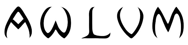
Chosen photo:
1) Identify anything/ Find a picture to work with
2) Go through trial and error with the extraction
3) Dissections with minimum 5 alphabets
4) Refine and refine

Fig 3.1 Chosen picture (10.9.2023-Week 2)

Fig 3.2 Traced letters- A,W, L,V, M (10.9.2023-Week 2)


Fig 3.3 Extracted letterforms- A,W, L,V, M
(10.9.2023-Week 2)
Reference:

Fig 3.4 Typeface reference -Sinhala MN (10.9.2023-Week 2)

Fig 3.5 Progression in AI (11.9.2023-Week 3)

Fig 3.6 Different stage of refinement(11.9.2023-Week 3)
After feedback given by Mr. Vinod, I decided to apply the
characteristic of "W" which is two curving sides meet at a relatively sharp angle at the
top of the arch to others letter.

Fig 3.7 Improvise (13.9.2023-Week 3)

Fig 3.8 Compiled process(13.9.2023-Week 3)

Fig 3.9 Original extracted letterforms compared to the
final type design(13.9.2023-Week 3)

Fig 3.10 Final type design(13.9.2023-Week 3)

Fig 3.11 Letter "A"(13.9.2023-Week 3)

Fig 3.12 Letter "W"(13.9.2023-Week 3)

Fig 3.13 Letter "L"(13.9.2023-Week 3)

Fig 3.14 Letter "V"(13.9.2023-Week 3)

Fig 3.15 Letter "M"(13.9.2023-Week 3)
Fig 3.16 Final Finding Type-PDF (14.9.2023-Week 3)
PART 2: TYPE SHOWCASE
We are required to select an image and combine it with the
final letters that were refined in Part 1.The text must be
integrated into a symbiotic relationship with the image.
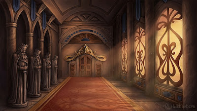
Process
The reason I choose this image is because the
characteristic of this image is related to my
letter from which is the point arch, whose two curving sides
meet at a relatively sharp angle at the top of the
arch.

Fig 3.17 Image have chosen(14.9.2023-Week 3)


Fig 3.18 Type showcase-movie poster process(14.9.2023-Week
3)
FINAL TYPE SHOWCASE
Theme: European Medieval Court Drama, a genre of theater
typically set in the courts and noble society of medieval
Europe. Encompass themes of medieval history, politics,
romance, betrayal, and intrigue, with courtly conflicts and
struggles at the heart of the plot.

Fig 3.19 Type showcase-movie poster(14.9.2023-Week 3)
Fig 3.20 Final Type movie poster
showcase-PDF (14.9.2023-Week 3)
FEEDBACK
Week 2
General Feedback: Avoid using contrast method.
Specific Feedback: Random system not random enough.
Radial system have some mistake for the tittle, should be
radial everything as well. Bilateral system should
not have vertical line.
Week 3
General Feedback: We should take an image that
have similar or consistent element throughout the
whole image instead of a picture that
have different element and just extract the letter from
anywhere.
Specific Feedback: Can take one characteristic of the
front after that apply to each extracted letter, make it
more consistent, no need to follow exactly what shape in the
image front.
REFLECTIONS
Experience
Moving on to Exercise 2, I wanted to create a font with a sense of luxury and sophistication, so I searched for an image related to palace interiors. However, I should have looked for an image with repetitive elements instead of a large scene with different elements, as it lacked consistency. Mr Vinod advised me to apply one letter's characteristic to the others, and I found it improved the design somewhat.
Observations
The entire task made me realise that typography have
many rules that we should aware for, and we learned
those system efficiently though exercise 1. More than
that, I feel like we need to have some improvement of
creating layout and letter, need to do more research to
enhance our learning progress.
Findings
FUTURE READING

Fig. 4.1 Typographic design: Form and communication
(2015)
The rapid advance of technology and the expanding role of visual and media-based communication in contemporary society have created new challenges for typographic education. Faced with a complex communications environment, and the changes that are occurring and are anticipated, how can a designer nurture sensitivity to typographic form and communication?
- Letter/digit configurations

Fig. 4.2 Letter/digit configurations
- Flowering typography
have been reduced into visually simplified forms. Each letter is coupled with a flower whose name begins with the chosen letter.


Fig. 4.3 Flowering Typography
- Inventing sign systems

Fig. 4.4 Inventing Sign Systems
- Comparative relationships: type and image
In this two-part project, students considered visual relationships
between type and image. After selecting photographs, students chose
typefaces and letterforms that related to the image through visual
characteristics such as shape, weight, decorative embellishments,
and other design attributes.

Fig. 4.5 Type and Image
- Sequential typographic forms in space

Fig. 4.6 Sequential typographic forms in space
- Typography and image transformations
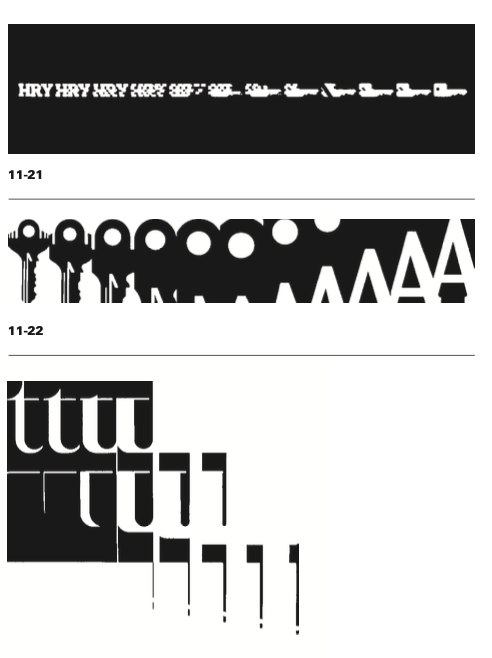
Fig. 4.7 Typography and image transformation
- Unity of form and communication


Fig 4.8 Unity of form and communication
- Syntactic explorations using onomatopoeic terms
Type style, size, and placement can express the meaning of words. Effective visual organization is achieved with the help of a grid. Words and pictures strengthen and even alter each other’s meaning.


Fig 4.9 Syntactic explorations using onomatopoeic terms
- Typographic hierarchy
hierarchy and composition, students built on their knowledge of letterspacing, wordspacing, linespacing, rags, and alignment.

Fig 4.10 Typographic hierarchy
- Calendar deconstruction

Fig 4.11 Calendar deconstruction
- Experimental compositions with found typography

Fig 4.12
Experimental compositions with found typography
- Banknote design

Fig 4.13 Banknote Design
- Typographic cubes

Fig 4.14 Typographic cubes
- Type and image in the third dimension

Fig 4.15 Type and image in the third dimension
- Expressive typography: form amplifies message

Fig 4.16 Expressive typography: form amplifies message
- Type as metaphor

Fig 4.17 Type as metaphor


Comments
Post a Comment